Ebook Design Tips: How to Make Your Book Look Professional
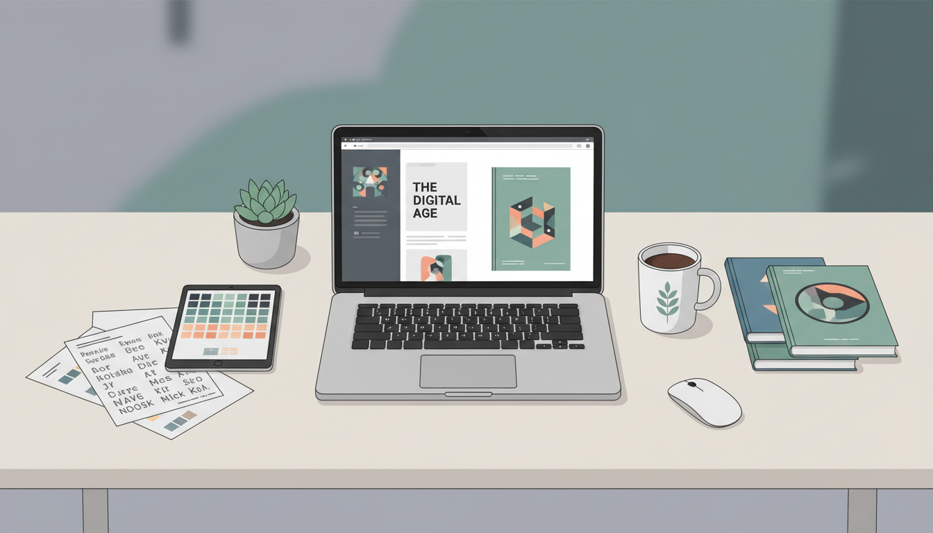
Creating a professional-looking ebook is crucial for success in today's competitive digital publishing landscape. Whether you're a first-time author or an experienced writer, implementing the right ebook design tips can mean the difference between a book that captures readers' attention and one that gets overlooked. The visual appeal of your ebook directly impacts reader engagement, credibility, and ultimately, your sales.
A well-designed ebook doesn't just look good – it enhances readability, creates a memorable brand experience, and positions you as a serious author or content creator. From typography choices to layout decisions, every design element plays a role in how your audience perceives and interacts with your content.
Essential Ebook Design Tips for Typography
Typography forms the backbone of any professional ebook design. The fonts you choose and how you implement them can dramatically affect readability and overall aesthetic appeal.
Choose readable fonts: Stick to clean, legible typefaces for your body text. Fonts like Georgia, Times New Roman, or Minion Pro work excellently for serif options, while Open Sans, Helvetica, or Calibri are great sans-serif choices. Avoid decorative or script fonts for large blocks of text, as they can strain readers' eyes during extended reading sessions.
Establish a clear hierarchy: Use different font sizes and weights to create visual hierarchy. Your chapter titles should be the largest, followed by subheadings, then body text. This helps readers navigate your content effortlessly and understand the structure of your information.
Maintain consistency: Once you've chosen your fonts, stick with them throughout your entire ebook. Consistency in typography creates a cohesive, professional appearance that builds reader trust and engagement.
Professional Layout and Formatting Strategies
The layout of your ebook significantly impacts how readers consume your content. A well-structured layout guides the eye naturally and makes your book more enjoyable to read.
White space is your friend: Don't try to cram too much content onto each page. Generous margins and spacing between paragraphs create breathing room that prevents your ebook from feeling cluttered or overwhelming. White space also helps reduce eye fatigue during longer reading sessions.
Create consistent margins: Standard margins should be at least 0.5 inches on all sides, with slightly larger margins on the inner binding edge if you plan to offer print versions. Consistent margins throughout your ebook maintain a professional appearance.
Use proper paragraph formatting: Either indent the first line of each paragraph or add space between paragraphs, but not both. Most digital books work better with space between paragraphs and no indentation, as this format translates well across different devices and screen sizes.
Color Schemes and Visual Consistency
Color plays a powerful role in ebook design, influencing mood, readability, and brand recognition. A thoughtful color palette can elevate your ebook from amateur to professional.
Stick to a limited color palette: Choose 2-3 colors maximum for your design elements. This might include your primary brand color, a complementary accent color, and neutral tones like black, white, or gray. Too many colors can make your ebook appear chaotic and unprofessional.
Ensure sufficient contrast: Your text must be easily readable against your background. Black text on white backgrounds provides optimal contrast, but if you choose colored backgrounds, make sure the contrast ratio meets accessibility standards.
Use colors strategically: Apply colors consistently for specific elements like headings, pull quotes, or call-out boxes. This creates visual patterns that help readers navigate your content more effectively.
Advanced Ebook Design Tips for Images and Graphics
Visual elements can transform a text-heavy ebook into an engaging, dynamic reading experience. However, images and graphics must be used thoughtfully to maintain professionalism.
Choose high-quality images: Only use high-resolution images that remain crisp when viewed on different devices. Pixelated or blurry images immediately signal amateur design and can damage your credibility.
Maintain consistent image styles: Whether you use photographs, illustrations, or icons, maintain consistency in style, color treatment, and sizing. This creates a cohesive visual language throughout your ebook.
Optimize for multiple devices: Remember that your ebook will be viewed on various screen sizes, from smartphones to tablets to desktop computers. Test your images across different devices to ensure they display properly and maintain their impact.
Use images purposefully: Every image should serve a purpose, whether it's illustrating a concept, breaking up text, or creating visual interest. Decorative images are fine, but they should enhance rather than distract from your content.
Creating an Eye-Catching Cover Design
Your ebook cover is often the first impression potential readers have of your work. A professional cover design can significantly impact your book's success in the marketplace.
Keep it simple and bold: Ebook covers are frequently viewed as small thumbnails, so your design must be clear and readable even at tiny sizes. Focus on bold typography and simple, impactful imagery that communicates your book's essence quickly.
Follow genre conventions: Research successful books in your genre to understand visual conventions and reader expectations. While you want to stand out, completely ignoring genre norms can confuse potential readers about your book's content.
Ensure mobile readability: Test your cover design at thumbnail size to make sure the title and author name remain legible. If readers can't read your cover on their mobile devices, they're unlikely to click through to learn more.
Tools and Resources for Professional Ebook Design
Creating a professional-looking ebook doesn't require expensive design software or years of training. Modern tools have made it possible for anyone to produce high-quality digital books.
Digital Maker AI's Ebook Writer stands out as an excellent solution for creators who want professional results without the steep learning curve of traditional design software. This AI-powered tool helps you create well-formatted, visually appealing ebooks by automating many design decisions while still allowing for customization.
The platform handles typography, spacing, and layout automatically, ensuring your ebook maintains professional standards throughout. You can focus on your content while the AI takes care of the technical design aspects that often trip up first-time ebook creators.
Other useful tools include: Canva for cover design and graphics, Adobe InDesign for advanced layout control, and Kindle Create for Amazon-optimized formatting. However, these tools often require more design knowledge and time investment than AI-powered solutions.
Testing and Quality Assurance
Before publishing your ebook, thorough testing ensures your design works across all platforms and devices where readers might access your content.
Test across devices: View your ebook on smartphones, tablets, e-readers, and desktop computers. Pay attention to how text flows, images display, and navigation functions on each platform.
Check different file formats: Depending on your distribution strategy, you may need multiple formats like EPUB, MOBI, or PDF. Each format may display your design slightly differently, so test each version thoroughly.
Proofread the final version: Design changes can sometimes introduce formatting errors or text issues. Always proofread your final, formatted version rather than relying solely on your draft manuscript.
Conclusion
Professional ebook design is an investment in your content's success and your reputation as an author or creator. By implementing these design tips – from choosing appropriate typography to creating cohesive visual elements – you'll produce ebooks that not only look professional but also provide an exceptional reading experience.
Remember that good design serves your content, not the other way around. The goal is to make your information accessible, engaging, and memorable for your readers. Whether you choose to learn design software, hire a professional designer, or use AI-powered tools like Digital Maker AI's Ebook Writer, the key is to prioritize your readers' experience while maintaining visual consistency and professionalism throughout your digital book.
Start implementing these strategies in your next ebook project, and you'll see the difference that thoughtful design can make in reader engagement and overall success in the digital publishing marketplace.